
Distinctive UI/UX Design & Scalable Design Systems.
We craft intentional, high-utility digital interfaces that eliminate user friction. No generic AI templates—every pixel is engineered for clarity, emotion, and commercial conversion.
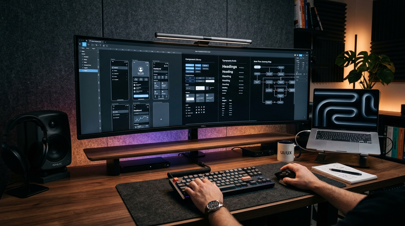
Interactive Design System Workbench
Explore dynamic theme tokens, elevation shadows, typographic contrast, and component states.
From Low-Fidelity Wireframe to High-Fidelity Design System
Zero unnecessary account wall friction.
Optimized for one-handed mobile grip.
Atomic tokens synced with engineering repo.
What our product design studio delivers.
From raw concept wireframes to interactive Figma prototypes and production design tokens ready for React.
Enterprise Figma Design Systems
Scalable typography hierarchies, color token aliases, auto-layout components, and dark/light mode variants.

Mobile App Wireframes & Interactive Flows
High-fidelity mobile prototypes that simulate native gestures, bottom sheets, navigation transitions, and real micro-interactions.

SaaS Dashboard & Portal Experience Design
Dense, clean, information-rich user interfaces that turn complex operational data into effortless administrative workflows.
Our Product Design Standards
Figma (Variables, Component Sets, Auto-Layout v5, Dev Mode)
WCAG 2.1 Level AA Compliant Contrast, Focus States, Screen Reader Labels
Framer Motion specs, Easing curves (cubic-bezier), Spring dampening values
Anti-AI-slop standard: purposeful typography, intentional color theory, real copy
Tokenized CSS variables, React component prop schemas, SVG asset exports
Unmoderated user testing, Hotjar session audits, Conversion funnel friction logs
UI/UX Design FAQ
UI/UX Design Frequently Asked Questions
Quick answers to the questions we hear most from clients.
Ready to elevate your product design?
Chat with our UI/UX design directors to review your current product screens or initiate a new Figma design sprint.